COLOR MATTERS! Color Psychology And How to Use It in eCommerce

Orange? Blue? Green? Which one of as many as 10 million colors the human eye can detect is your favorite one?
You can tell a lot about a person by their favorite color and you can tell a lot about an online store by the colors used thereon as well.
Scientific fact! The human eye is a marvelous thing. A human eye has three types of cone cells, each of which can distinguish 100 different shades of color. Color-blind people (dichromats) have only two cones and see 10,000 colors, and tetrachromats (only 1% of people) have four cones and see up to 100 million colors.
Humans are visual creatures. We are driven by the visual cues around us. If something is visually appealing, we stop and look at it, we pay attention, and this applies to your website, too.
Funny remark! Mantis shrimp is a rock star! As compared to humans' measly three color-receptive cones, the mantis shrimp has 16 color-receptive cones, can detect ten times more color than a human, and probably sees more colors than any other animal on the planet. (source)
That alone should be reason enough for many of you to go and think about the colors you use on your eCommerce website.
Color Theory
Color wheel
The color wheel is a visually easy way to understand the relationships between colors. The traditional color wheel offers 12 colors.

Image source: Canva
The primary colors in the wheel are red, yellow and blue, and these can be used to create secondary colors (orange, green, violet). By mixing primary and secondary colors we get tertiary colors – red-orange, yellow-orange, yellow-green, blue-green, blue-violet, and red-violet. To learn more about colors - check Johannes Itten book "The Art of Color".
Color Psychology
What is Color Psychology?
Color psychology is basically the study of how color influences the decisions people make. If you understand color psychology, you can capitalize on that knowledge to create brand relevance and accelerate purchases. It enables you to forecast how shoppers will react to your promotional messages based on the color scheme you are using.
If you want to choose the best color scheme for your persuasion efforts, you need to develop a robust vision of your brand, how you intend to penetrate the market and the characteristics of your target shoppers.
What type of image do you intend to depict? Is it authority and luxury? Is it confidence and cheerfulness? Or, is it purity and efficiency?
How Color Psychology Influences Buyers' Emotions
It’s no secret that humans are visual creatures. 90% of information transmitted to the brain is visual, and visual information is processed 60,000 times faster than any other type.
Interesting fact! The human eye is a marvelous thing. According to a study conducted by the Seoul International Color Expo, over 92% of people said that color plays an integral part when purchasing merchandise.
Think about it, when was the last time you heard of someone who bought a car and didn’t care what color it was?
Color psychology has a real impact on our behaviors, and this includes purchasing behavior. When you’re working on your site, your colors should reflect your brand identity, your logo, and your motivations. The colors you choose for your E-commerce will have a direct emotional impact on the visitors and buyers on your site.
Key point! Getting the right mix of colors can mean the difference between a repeat customer and a fleeting one-time visitor.
Therefore, it goes without saying that catching the customer’s eye with an intelligent layout of colors is integral to eCommerce success.
Warm and Cool Colors
Colors are often classified as being either warm or cool. Warm colors include red, orange, yellow, while cool colors include blue, green, and purple. Warm and cool color groups have a psychology of their own. Generally, warm colors are thought of as being energetic and exciting while cool colors are thought of as being calming and even sad.
Key point! Remember, color psychology is not an exact science. Given the right context and color combinations, colors from the warm spectrum can be “sad” and colors from the cool spectrum can be “exciting
Hues, tints, shades, and tones
The traditional color wheel only shows pure colors (also known as hues). But the world of color has so much more to offer. This is where tints, shades, and tones come into play.
Pure color = huePure color + white = tintPure color + black = shadePure color + gray = tone
There aren’t a lot of pure colors in our everyday life, so the human eye finds tints, shades, and tones much more pleasing. Whenever you create a tint, a shade or a tone, the actual hue remains the same, it just gets lighter, darker, or less vibrant. So, this process doesn’t affect the position of the color on the color wheel, but each variation can evoke an entirely different feeling or convey a different message.
For example, tints, which we sometimes call pastels, are linked with tranquility and peace. So it’s no wonder that travel agencies that focus on finding your inner self find pastel-colored schemes well-suited for them.
Shades, on the other hand, are associated with sophistication, experience, and confidence, so they are often seen on sites that deal with high-end products and want to attract high-end clientele.
Triggering the Right Emotion
One of your first steps in figuring out how to approach color for your eCommerce store is to understand colors attributes to build rapport with your audience right off the bat and get them to feel a certain emotion, and thus convert.
Here are some main colors and the feelings they evoke, both positive and negative (source):

And some more …

NOTE: The truth is, color psychology is more nuanced than that. Keep in mind that these colors are geared specifically around a North American demographic and aren’t necessarily applicable to shoppers from other areas of the world.
🖤 BLACK = power and luxury.
The darker the tone, the more lux it is, says our internal color psychology. This is a powerful color that can be used for a wide range of emotional responses.
If you are selling high-end luxury items on your website, black probably would be a good choice. You will have hit the nail on the head by mixing black with other tranquil and stylish colors such as gold and silver.
NOTE: The meaning of black changes depending on what other colors it is used with.
EXAMPLE: Lamborgini cars are not cheap. Absent from the site are colors and designs of whimsy and fun. This is a serious value. Black is the name of the game:

WHITE is also powerful.
White is forgotten sometimes, probably because it's mostly used as a background color. And it is primarily used as a background color because it contrasts very well with a majority of the text colors. Most well-designed websites today use plenty of white space as it's a powerful design feature.
EXAMPLE: Johnnie Walker uses black and gold on its site and white as a background color to portray elegance.

ADVICE: Always include empty white space around your content so that customers don’t feel boxed in.
Extensive use of white space sends a powerful message to the audience. For instance, the most visited site on the Internet is essentially white in color.
White on an eCommerce site conveys the notion of purity, freedom, innocence, efficiency, and breathability.
💙 BLUE cultivate user’s trust.
Blue is one of the most-used colors, with good reason. A lot of people like blue. And there is a wide agreement in the research community on its psychological effects.
I'm sure you repeatedly notice the sheer number of companies that utilize the color blue to their advantage.

Image source: Artitudes Design
The color blue is a color of trust, peace, order, and loyalty. It is associated with wisdom, calmness and serenity. Its subtle message of trustworthiness and serenity is true. And you can use this to your advantage on your website and landing pages.
NOTE: The meaning of blue varies more greatly based on shade and hue than other colors. For example, a darker blue might evoke greater feelings of security while a lighter blue feels much friendlier.
EXAMPLE: Blue is a very popular color among financial institutions as it can denote trust. A company that serves as a conduit for billions of dollars, PayPal, also prefers the color blue.

ADVICE: Never use blue if you're selling foodie stuff.
Although blue is pretty much an all-around great color, it should never be used for anything related to food. Dieters have used blue plates to successfully prevent them from eating more.
💚 GREEN = relaxing feeling.
Green is a color for growth and versatility. If the focus of your website has anything to do with nature, environment, organic, or outdoors, green should be your color of choice. It's common on websites passionate about environmental issues. Can be used to promote organic products.
Green isn’t just about nature, though. Green is also closely associated with money, wealth and prosperity, often with mint greens.
Green is actually the easiest for the eyes, giving the visitors to your site a more relaxed feeling. When customers see green on your eCommerce site, they tend to feel calmer, and more comfortable and confident when making the purchase decision.
ADVICE: Green also is a good call to action color, especially when used in combination with the “isolation effect” (von Restorff effect) which states that you remember things better if they stand out.
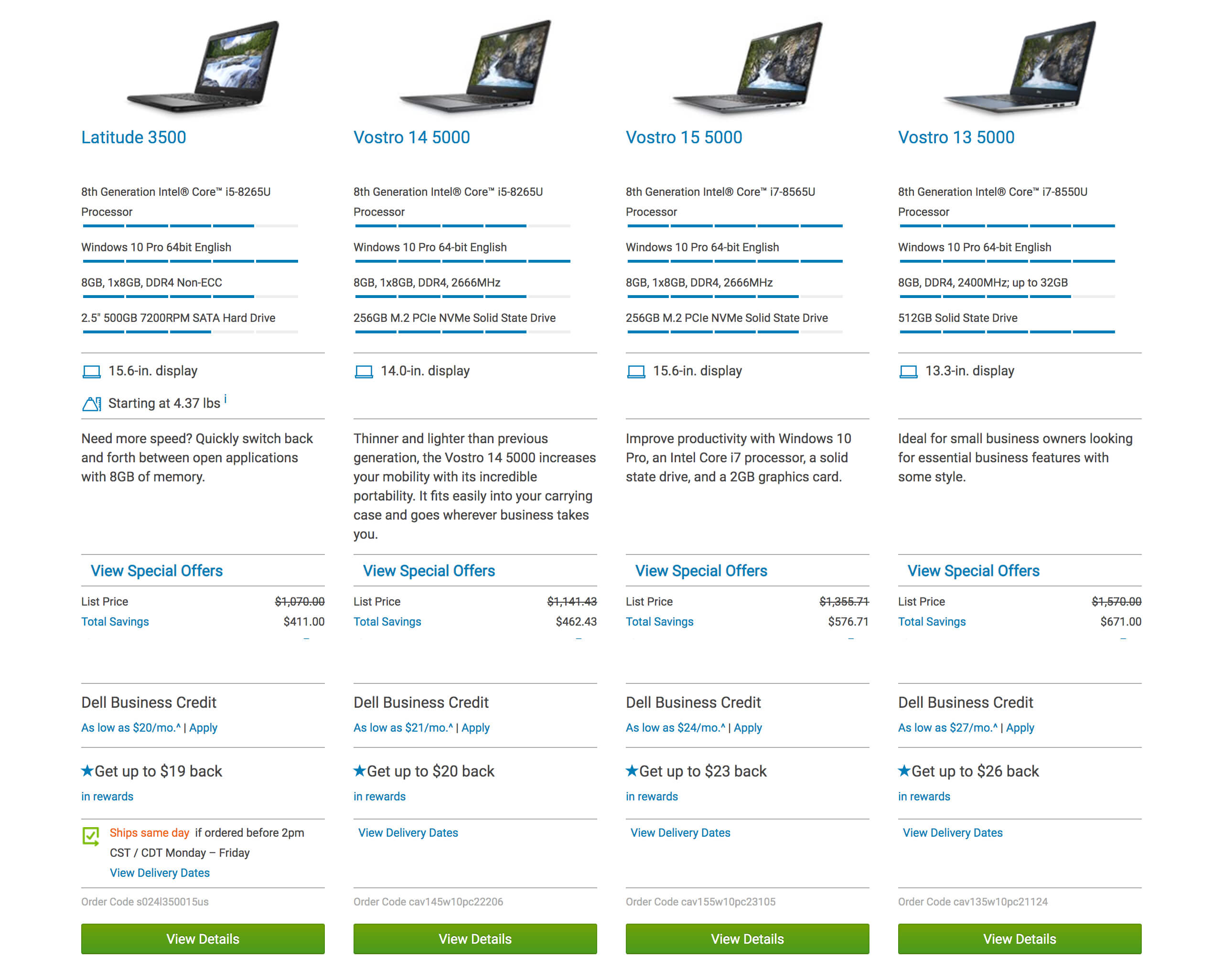
EXAMPLE: All of Dell's conversion elements are green.
❤️ RED = urgency.
Red is a good example of context being important. “Love” and “anger” are contradictory feelings, yet both are ascribed to red.
Red can also have a physiological effect. Seeing red has been shown to increase heart rate, adrenaline, metabolism, and respiration. This color is useful for spontaneous purchases.
Red is a primal color that is associated with urgency, which is why it’s most often used with clearance sales.
It can convert potential buyers into lifelong customers if used correctly. But beware, too much red on a webpage can be visually overwhelming.
EXAMPLE: Target uses red as the main brand color.

🧡 ORANGE is a fun color.
Orange is stronger than yellow but friendlier than red. Orange evokes positive excitement. It can be used as the “fun” color.
Orange helps to “stimulate physical activity, competition, and confidence.” This may be why orange is used heavily by sports teams and children’s products.
In fact, there are a ton of sports teams that use orange: Florida Gators, Clemson Tigers, Boise State Broncos, Syracuse, New York Knicks, New York Mets, Cleveland Browns, etc. It makes sense. Orange means active. Orange means fun. Orange means togetherness.
Also, orange can lead to a feeling of haste or urgency on a site.
EXAMPLE: Amazon uses orange in their banners and to show the number of products in the Cart.

They also use orange as the color of product link hover. The color makes it more noticeable and actionable.
Moreover, I believe, you have seen orange labels pointing out Amazon best sellers on many occasions.

BUT...
Sometimes, orange is interpreted as “cheap.” Forbes posed the question, “Does orange mean cheap?” in an article on the “Effect of Color on Sales of Commercial Products.” The resounding answer was “yes.” If your product offering is cheap, or if you want it to be seen as such, orange may be a good choice.
NOTE:
1. Orange is great for calls to action like subscribe, buy, or sell.
2. Orange paired with cool shades of blue can give off a positive and exciting vibe.
💛 YELLOW is for warnings / YELLOW = optimism and cheerfulness.
Yellow is a cheerful and playful color that can really increase warmth in people and grab the customers’ attention. Yellow brings excitement in purchasing items and assist convey a sense of happiness to the site.
As such, you can use this color in sections of your eCommerce site where you want your visitors to explore further, for example, in call-to-action buttons.
EXAMPLE: IKEA uses yellow to make the buyer feel happiness when seeing and thinking of their brand.

At the same time, yellow can also be associated with caution and warning. It's mostly used for traffic signals, wet floor signs, etc.
According to some research, yellow activates the anxiety center of the brain and consequently, heightened anxiety level during any website experience is never a good thing, unless it comes in small doses.
ADVICE: Try to avoid excessive use of yellow, as it can strain the eye (especially bright yellow) and turn customers off your site.
Thus, a yellow call to action may create just a touch of anxiety that’s needed to make them click the desired call to action.
EXAMPLE: Amazon, for instance, utilizes yellow in its “add to cart” button to great effect.

💗 PINK
In Western culture, pink is most often associated with femininity and is avoided as a color used to target men. Sports teams have been known to paint the “away” locker room pink because of the color’s calming effect.
This is the color most frequently used to market to women and girls for its feminine appeal. This color is used to create a feeling of softness and serenity.
EXAMPLE: Victoria Secret uses shades of pink to convey romance and gentleness. Using soft pinks the brand communicates a sweet, romantic, feminine message. Pink has a calming effect and at the same time creates a sense of vibrance and playfulness.

Even though pink is usually associated with femininity, it can appeal to males as well since it exudes kindheartedness, romance, and love. Pink has a soothing effect so it can be used to offset more aggressive colors like black, orange and red.
PURPLE
Purple is historically associated with royalty, power, and affluence. Purple dye was more expensive in ancient times and only the wealthy could afford it, leading to purple being known as a royal color.
Purple is used as a soothing color in shopping. This color is often the mark of creativity and imagination, which is especially effective for making the buyer feel that a product is luxurious or artistic.
Intelligent use of this color can help the customer to make a positive purchase.
BROWN
Brown is a strong and dependable color which is very reassuring to shoppers. It gives off an aura of confidence and, if used in the right amounts, can help convert a potential customer.
GRAY
Balance and innovation: Gray is the color that we see when we think of technology- and for good reason. This color is anything but bland- and can be used effectively to symbolize neutrality, innovation, and knowledge.
Grey is usually connected with seriousness and a conservative mindset. The right shades of grey can serve as a great backdrop for other more vibrant colors such as orange, red, and royal blue.
GOLD
Gold takes on many of the emotional connections of the precious metal of the same name. Gold is often used as a secondary color in design to emphasize wealth. On its own, gold can be very similar to yellow.
SILVER
Silver is similar to gold but with less luster. Where gold is bright and exciting, silver is cold and scientific.
What We Get Wrong About Color Psychology
We, human beings, are incredibly complex creatures, and the emotions we feel toward a particular color can be influenced by a host of factors like personal experience, upbringing, cultural differences or simply how we’re feeling at the moment.
Therefore, it’s not realistic to assume that simply using yellow instead of green on your homepage will lead to instant results and send conversions through the roof.
There’s just so much more to it than that.
But at the same time, it would be foolish to think that color doesn’t play a role.
Of course, it does!
Demographics
Perhaps the most vital factor that determines the color scheme you should use is your demographic.
To begin, let’s start by discussing color preference based on gender.
a. Gender

[According to study]
👩 ❌ Women don’t like orange, brown and gray.
👩 💚 They like blue, purple, and green.
Other studies have corroborated these findings, revealing a female aversion to earthy tones, and a preference for primary colors with tints. Look at how this is played out. Visit nearly any eCommerce site whose target audience is female, and you’ll find these female color preferences affirmed.
Interesting fact! Most people believe that the universally-loved female color is pink. It’s not. Just a small percentage of women choose pink as their favorite color.
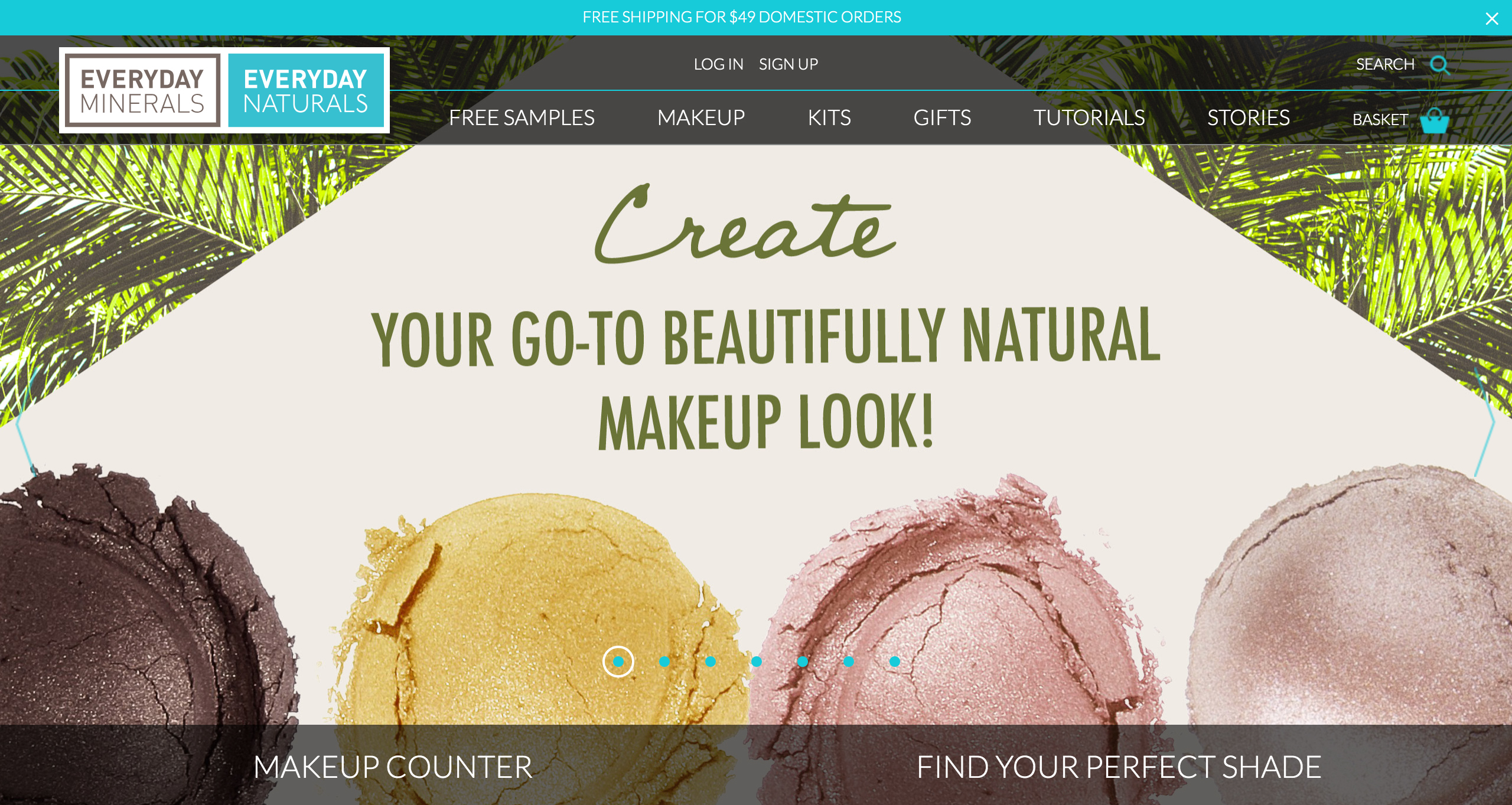
EXAMPLE: Everyday Minerals has a primarily female customer base with blue and green on the homepage:
EXAMPLE: Estee Lauder uses a shred of purple for their Mother's Day banner:

Therefore, you may consider limiting its use on your eCommerce website if you intend to appeal to women shoppers. A number of eCommerce websites, whose target audience is primarily women, use this trick.
👨 ❌ Men don’t like purple, orange, and brown.
👨 💚 Men like blue, green, and black.
If your eCommerce site has products suited for men, these are the colors to stay away from purple, orange, and brown. Instead, use blue, green, and black. These colors — blue, green, and black — are traditionally associated with maleness. However, it comes as a slight surprise to some that brown isn’t a favorite pick.
Interesting fact! Surprisingly, most men do not prefer the brown color.
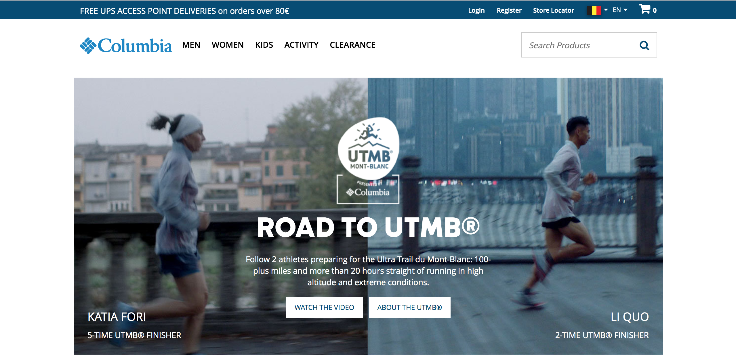
EXAMPLE: Columbia is using blue as their primary color.
EXAMPLE: Skullcandy uses masculine colors for promoting its products.

Now let’s take it one step further.
Hues, tints, shades, and tones
This data suggests that incorporating bright colors into your homepage would be beneficial if you’re targeting a male demographic, and soft colors would be better if it’s a largely female demographic.
When it comes to achromatic colors, it’s probably something to avoid if your primary audience is female.
Now let’s discuss tints and shades.
Shades tend to work well with men, while women naturally prefer tints.
b. Age

Image source: Persuasion Nation
However, the results get more interesting when we compare color preferences and age groups. In this case, it is important to highlight a few notable findings:
-
Older people almost exclusively prefer white and blue, not showing enthusiasm for any other color.
-
Young people (aged 19 to 24) are more likely to experiment with different colors, so they show enthusiasm for alternative colors such as brown, black, and green.
-
Middle-aged individuals enjoy purple hues, adoring its royal and luxurious appearance.
What is interesting to notice is that almost every age group and gender considers brown and orange to be the least eye-pleasing colors.
c. Culture
Color is closely tied with culture. Therefore, culture perception of color should also be accounted for.
EXAMPLE: Germany one of the biggest eCommerce markets in Europe, so it’s a good place to target. But while most of the Western world associate yellow with fun in the sun, Germans connect yellow with envy.
(a) Poles connected to anger, envy, and jealousy with purple;
(b) Americans associated envy with black, green, and red;
(c) For the Russians, it was black, purple, and yellow.
EXAMPLE: White has a strong connection with purity and innocence in Western culture and is traditionally used in weddings. Japanese culture traditionally reserves white for funerals.
What About Your Call-to-Action?
Your call-to-action (CTA) is one of the most important elements of your homepage. When it comes to choosing a color, conventional logic would suggest that you should go with something bold like red.
So by analyzing these findings, it would naturally make sense to always use a red CTA. Right?
Not necessarily.
What’s most important is to create contrast. When you really boil it all down, that’s really what you’re trying to achieve.
It really just depends on the rest of your color scheme and the keyword in the color psychology of CTAs is contrast.
Use bright primary colors for your call to action.
In strict testing environments, the highest-converting colors for calls to action are bright colors, such as red, green, orange, yellow. They capture the attention of shoppers more easily.
Darker colors like black, dark gray, brown, or purple have a lesser engagement with the customers and so, very low conversion rates.
EXAMPLE: Petcube is using orange and white for their CTAs.

Some of the best conversion colors are the “ugly” ones — orange and yellow. An article on ColorMatters.com states, “Psychologically, the ‘anti-aesthetic’ colors may well capture more attention than those on the aesthetically-correct list.” Since the goal of a conversion element is to capture attention, then you may do just fine with that big orange button (BOB). Or yellow.
Use a complementary color for your call to action.
The most straightforward way to create contrast between your CTA and the rest of the page is to use a complementary color.
And here are some examples of complementary color combinations:

Probably One The Worst Color Schemes Ever
If you’re a sensitive soul with design proclivities, it would be better for you to skip the next paragraph.
You can learn a lot about what not to do from failure. But this site is not a failure – it's is a so-called successful mutant.
There’s no way your website should look exactly like this one. But it represents a lesson in making a website that actually works.
Let’s check it.
LINGSsCARS
Lots of incompatible colors and a complete mess in general.

Chinese-born, UK-based car rental businesswoman Ling Valentine has one of the most appalling websites. But she must be doing something right because she gets an amazing amount of traffic. It’s all organic, and it’s worth a ton of money.
Ling’s website might be (might be? Definitely is) downright terrifying. But her customers seem to like it. Her business is booming.
Based on that Ling turned over $106,192,200 in 2015 (her figures). And that’s what a website should do.
Finally ... Which Colours Should I use?
Unfortunately, a lot of eCommerce entrepreneurs don't know that the various colors they use on their website can have a significant impact on the mood of their customers.
If you're among those who don't pay attention to colors, now you will, we hope!
With humans being innately visual by nature, it only makes sense that color would play a key role in consumer purchasing and overall decision making.
Now that you know the real-life consequences that color choice can have on your business, you may be thinking about a color change.
Or perhaps you’re going through a re-branding process. Either way, one of the most fascinating aspects of eCommerce color psychology is that each color has its own emotional triggers.
Here are some basic tips on how to use color in the right way, with the right audience, and for the right purpose:
-
Just like in any other marketing strategy, first, you have to look at your product and to whom you’re selling. It’s been proven that customers take into account whether your product fits the branding – the colors you pick have to represent what you’re selling. If your main focus group is organic foodies, then green or brown is probably the way to go.
-
Test several colors. Despite what some may say, there is no right color for a conversion text or button. Try a green, purple, or yellow button. Explore the advantages of a black background scheme vs. a white background. Do your research, conduct some A/B tests, and work those results into your eCommerce business. Find out which works best for your audience and with your product.
-
Use psychology-appropriate colors that match the existing color scheme. Sure, you need to adapt to the color scheme, but you can still use a splash of strategic color here and there.
-
Avoid color overload. White is a color, and it should be your BFF color, too. Reign in your color enthusiasm with a whole lot of white. Too many colors can create a sense of confusion.
-
Don't forget about negative space. Using ample negative space helps balance the overall design out and should prevent it from overwhelming your visitors.
-
Remember that the color that you don’t use can be just as important as the color that you do use.
And...
Remember that everyone can tap into the internet’s big box of ideas. Granted, not all of the ideas are successful or even remotely good, but there’s always something to take away. Examples help if you’re starting something new, looking to rebrand or just trying to find some useful tips. There are tons of places that neatly showcase the best and worst website designs with great color schemes, and you, for sure, come across many examples of different websites every day.
But, as LingsCars example shows (and it is not the only one example), you shouldn't directly follow all the tips on "How To Run Your eCommerce Business Successfully", even though the latter are based on the fundamental studies. Sometimes just be unique and follow your intuition and personal fancy tastes!!!
Top 7 Articles related to the topic:
1. Neil Patel - How to Use the Psychology of Color to Increase Website Conversions
2. Hubspot - The Button Color A/B Test: Red Beats Green
4. CoSchedule - The Know It All Guide To Color Psychology In Marketing + The Best Hex Chart
6. Sleeknote - Everything You Need to Know About Color Psychology (A Research-Backed Guide)
7. Quicksprout - How to Choose the Right Color Schemes for Your eCommerce Shop
Did we forget anything? Let us know in the comment section below.


Newsletter